The product gap
The flagship site had no complete mobile layout system for its shared structure and technical content.

kernel.org is not merely the Linux kernel project's homepage. Maintained by the Linux Kernel Organization to distribute the Linux kernel and other open-source software to the public, it is the official release surface for upstream mainline, stable, and long-term kernel releases, source archives, and cryptographic signatures. It sits at a critical point in the software ecosystem, at the foundation of countless operating systems, devices, servers, and development platforms.
Despite that role, kernel.org still behaved like a fixed desktop layout on phones. Content rendered at the wrong scale, wide technical material escaped the viewport, and shared sections were not designed to reflow into a coherent mobile experience.
The visible problem was the website. The less visible problem was the contribution path. kernel.org had a public source repository, but there was no clear, documented workflow for an outside front-end contributor to propose a site-wide change, put it in front of the right steward, and move it through public review.
The flagship site had no complete mobile layout system for its shared structure and technical content.
Earlier calls for front-end help had not become a durable public workflow for reviewing website contributions.
The site lacked both the mobile system and the contribution system capable of producing one.
The route into kernel.org began through an adjacent contribution. While Rito's gitweb work was progressing through Git's mailing-list process, he also made the GitGitGadget website fully mobile friendly and shipped several follow-up improvements around its identity, navigation, and publishing surface.
Those changes were reviewed and merged by Git for Windows maintainer Johannes Schindelin, who directly saw the quality of the work and expressed strong appreciation for the care behind it. Rito then asked whether Johannes knew anyone who could help him reach the people responsible for kernel.org.
This was not a cold request built around an abstract idea. Rito already had the kernel.org mobile work implemented, a live demo showing the result, and a patch series ready for review.
Johannes responded by opening a public thread connecting the completed GitGitGadget work to Rito's kernel.org demo and asking whether the infrastructure team was interested. Konstantin Ryabitsev, the Linux Foundation's infrastructure lead for kernel.org, joined the discussion and became the steward for the contribution.
The sequence mattered: successful work in one gatekept ecosystem supplied the trust needed to enter another. The public introduction converted that trust into an accountable review opportunity rather than a private favor or an untracked handoff.
The introduction exposed an unresolved organizational question: where should kernel.org website changes actually be reviewed? The Git mailing list provided a transparent place to begin, but the website was not a Git subsystem and there was no dedicated kernel.org front-end list.
Rather than moving the work into an invisible private exchange, Rito advocated for a public process while respecting the Git list's scope. Konstantin resolved the routing problem by directing this class of contribution through the kernel.org tools mailing list.
That decision did more than provide a destination for one patch series. It created a formal, repeatable path through which outside contributors could submit kernel.org website work for public review.
By the time the review path existed, the contribution was already concrete. Maintainers could inspect the live mobile result, compare it against the existing site, and evaluate a complete implementation rather than debating whether somebody should eventually attempt a redesign.
The root cause was narrow and specific. Pages rendered against a desktop-width viewport, so content arrived tiny and readers were forced into a pinch-zoom and horizontal-pan routine instead of plain vertical scrolling. The first patch set the viewport to the device width, which established the correct baseline and, in doing so, exposed the latent layout problems that a desktop-width canvas had been hiding.
The remaining five patches addressed those problems with targeted responsive adjustments inside the site's existing Pelican templates and single stylesheet. The series deliberately stopped short of a redesign. It adapted the shared layout around the existing product rather than replacing its visual identity, rebuilding it on a new stack, or altering the desktop layout at all.
Before and after: kernel.org on a phone
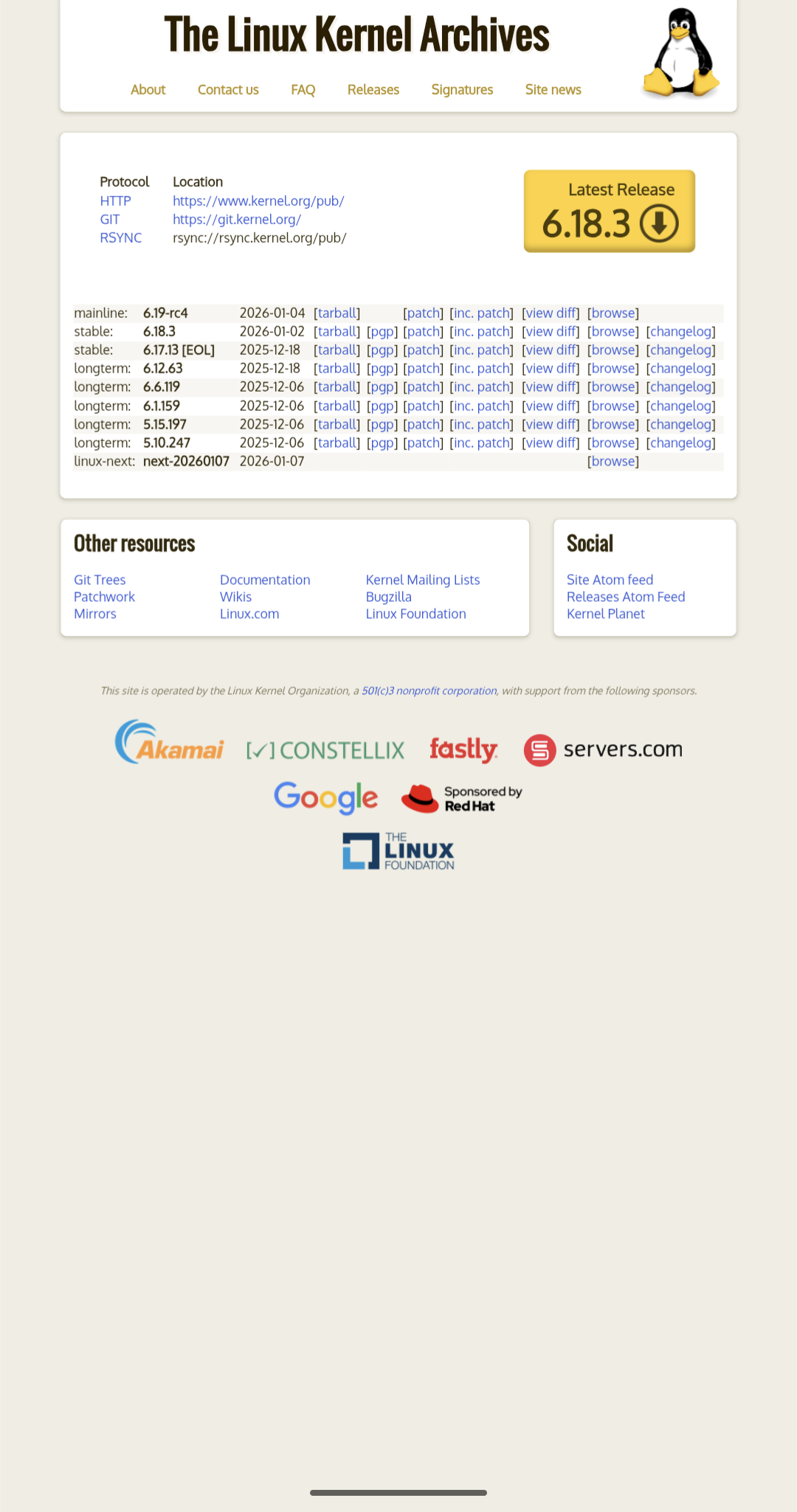
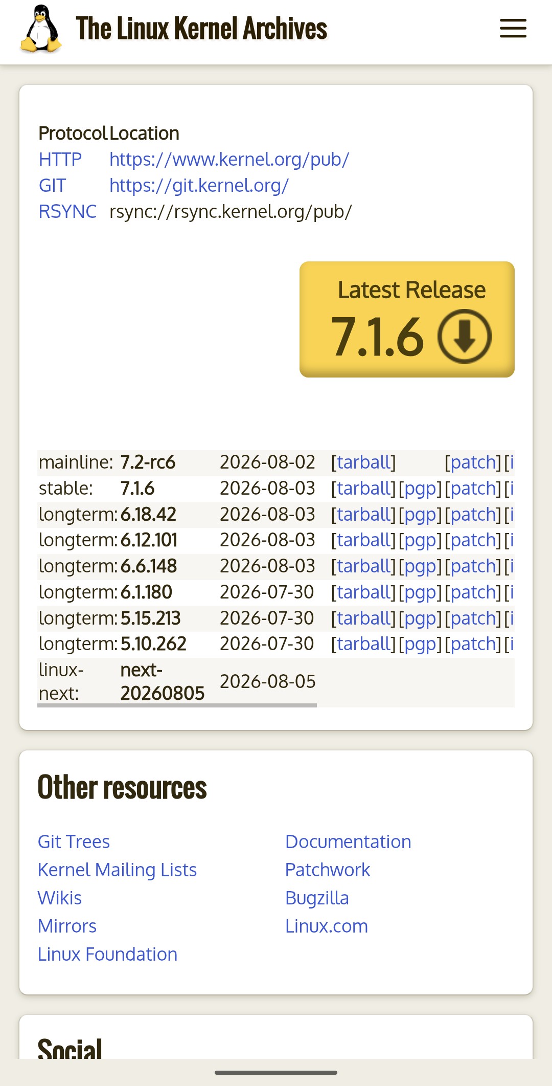
Before, the whole desktop page is scaled down to fit the viewport, leaving the release table and every link too small to read or tap, with the page running out of layout partway down the screen. The after is the live site, so it also carries the sticky bar from the later drawer series.
After: contained overflow at the bottom of the homepage
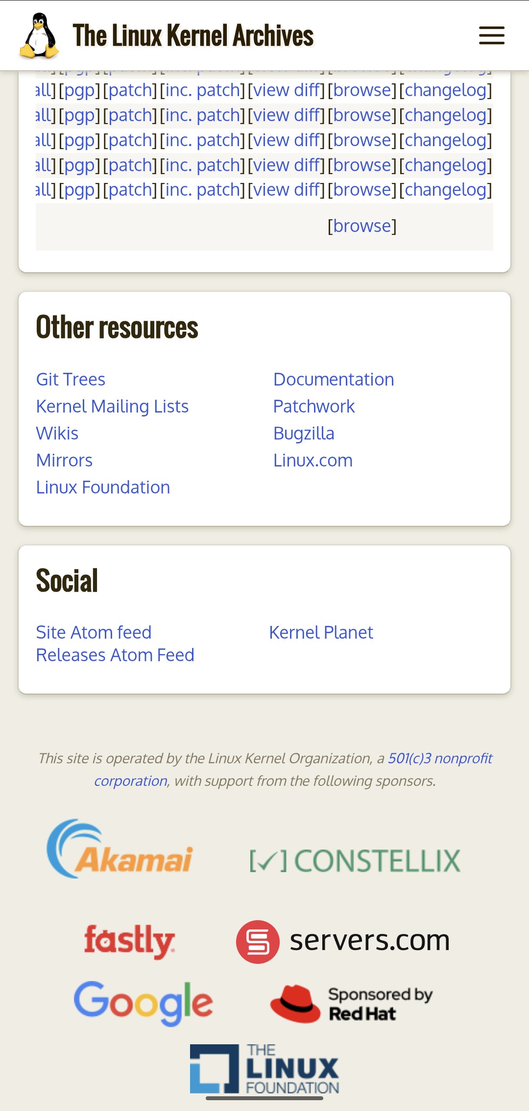
The releases table scrolls sideways within its own container rather than dragging the page with it, and the resource, social, and sponsor blocks wrap instead of overflowing. The sticky bar visible at the top is the later drawer series, since this is the live site rather than a snapshot of the first series alone.
The contribution did not land through a quick transactional merge. The series was submitted in March 2026 and applied four and a half months later by kernel.org's infrastructure lead. Website work sat below functional infrastructure priorities for most of that window, and the maintainer said so directly when asked.
Rito stood up a live demo of the rendered result and offered it alongside the series so reviewers could evaluate it on a real device instead of reading CSS, noting in the same message which two elements of that demo went beyond the exact patchset. Reviewer attention was the scarce resource, so the submission was built to consume as little of it as possible.
The rest was patience and periodic, professional follow-up across the window, including a direct request for a clear signal on whether theme work belonged in that channel at all, and an offer to route it elsewhere if it did not. The series was never allowed to quietly expire, and it was never escalated into a conflict either.
The important outcome was not merely that a prepared patch series was accepted. An outside contributor moved a site-wide design and engineering change through a contribution route that became more formal because the work required one, and then kept that route open long enough for the change to actually land.
The first series made kernel.org render correctly at mobile widths, but it left the navigation itself unresolved. On small screens the menu wrapped into a dense block of closely spaced links, the banner consumed significant vertical space, and because content reflows into a single narrow column, returning to the navigation at the top of the page meant a far longer scroll than the same trip on desktop.
Rito sent a follow-on two-patch series the same day the first one landed, through the same kernel.org tools list route. That is the part worth noting: the review path created for one patch series carried a second one, which is the difference between a workflow that exists on paper and one that actually moves work.
kernel.org is a Pelican static site built from Jinja templates and a single stylesheet, with no client-side application layer to build against. The drawer therefore had to work with no JavaScript at all. It is driven by a checkbox and label toggle, with every rule scoped to the site's existing 848 pixel media query so the desktop layout is left untouched.
The visible result is a compact sticky top bar carrying the same site title and logo, with a hamburger control that opens a drawer over a dimmed overlay. Because the bar is sticky, navigation is reachable at any scroll position instead of only from the top of the page.
After: the drawer on kernel.org
The compact sticky bar carries the site title, the Tux logo, and the menu control. It replaces a banner that had been consuming a large share of the viewport before any content appeared.
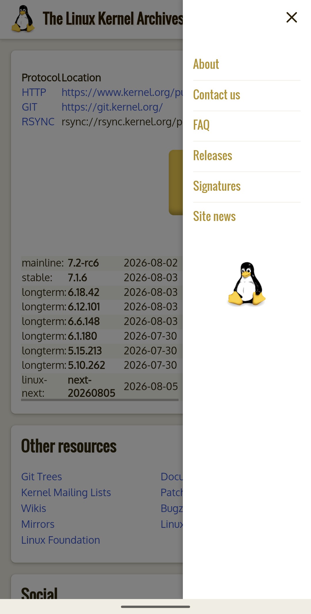
Opening the drawer slides the menu in over a dimmed overlay, with the close control at the top and every top-level destination listed. Tapping the overlay closes it, and no JavaScript is involved in any of it.
The checkbox is the only operable control, so it is hidden with clip-path rather than display: none, which would have removed it from the tab order entirely. Space toggles the drawer.
The labels are pointer affordances only, marked aria-hidden with no tabindex. A label does not respond to Enter or Space, so making one focusable would advertise a control that cannot then be operated.
Once the open drawer paints over the hamburger, a ring drawn there would sit behind it. The focus styling moves to the close icon instead, so the indicator is always on whichever affordance the user can actually see.
The closed drawer is set visibility: hidden so its off-screen links cannot be tabbed into, with that change delayed just long enough for the slide-out to still animate.
Reduced-motion users get the same correctness rather than a different set of bugs. Under prefers-reduced-motion the slide and fade are dropped, but the visibility swap is kept, so opting out of animation does not quietly leave the closed drawer's links sitting in the tab order.
The series did not land cleanly the first time. It was applied and then backed out after the deployed site appeared to render incorrectly. Rather than immediately rewriting code that tested correctly, Rito reported that the result rendered as expected on his side and asked what the failure looked like. The breakage was traced to a Fastly caching error rather than anything in the patches, and the series was reapplied the next day. It is live on kernel.org now.
That exchange is a small thing that matters. The reflex when a maintainer says a change broke something is to apologize and start revising. Checking first, and saying so plainly, kept a correct patch from being rewritten around a problem it did not cause.
kernel.org now presents the official upstream Linux kernel release and distribution surface through a coherent mobile experience across the shared layouts and technical content that define the site. Developers, maintainers, and downstream users can access releases, verification material, and supporting infrastructure without navigating a desktop canvas from a phone.
Navigation on that surface is now a compact sticky bar and a drawer that opens at any scroll position, built with no JavaScript, no new dependencies, and no change to the desktop layout.
The work also left behind a clearer organizational interface: a public place for kernel.org website contributions to be proposed, reviewed, and stewarded. The second series is the evidence that the path holds. It went out the day the first one landed, through the same channel, and did not need the routing question reopened. The shipped result was both a modernized flagship surface and a route that has now carried website work more than once.
Eight commits landed on kernel.org's website repository at git.kernel.org, authored by Rito and applied by Konstantin Ryabitsev.
Responsive series, applied July 2026:
6e5ed1f add viewport meta tag for proper mobile rendering0622f44 prevent wrapped headings from overlapping with text above itf353913 add 848px mobile banner adjustments to prevent overflow9a34fc6 add responsive extras and footer layout adjustments to contain overflowa2861e8 contain horizontal overflow in core content and homepage releases layout20a0d8c improve mobile rendering of docutils tablesDrawer navigation series, applied August 2026:
8b221bd add mobile drawer navigation with a compact sticky top bardaab20a drop mobile banner rules made unreachable by the drawerReview threads:
Quick Highlight: Made site-wide improvements to the documentation site inside of the Linux kernel repository.
docs.kernel.org is generated from documentation maintained directly inside the Linux kernel repository. Changes to the site are therefore submitted as kernel patches, reviewed publicly through the linux-doc mailing list, and accepted through the Linux kernel's established repository workflow.
Rito contributed a set of shared improvements spanning the documentation site's identity and narrow-viewport behavior. Rather than modifying isolated pages, the patches corrected recurring presentation problems at the theme and content-rendering level.
The work added the first favicon for docs.kernel.org by reusing the project's existing Tux artwork, giving the official documentation a consistent identity in browser tabs and bookmarks. View patch.
Rito also addressed several recurring sources of layout breakage across the site:
The implementation treated different forms of technical content differently. Prose and inline tokens were allowed to wrap where doing so preserved meaning, while structured technical material retained its readable width through local scrolling.
These changes followed a different path from the kernel.org mobile work. The flagship website contribution required finding the responsible steward and helping establish a public review route for outside website changes.
The documentation patches were submitted directly against the Linux kernel repository and reviewed within its established documentation subsystem. Landing work through both paths demonstrated the ability to operate across two distinct layers of Linux infrastructure: the public flagship website and the source-controlled documentation system maintained inside the kernel itself.
Together, the kernel.org and documentation work show repeated design and engineering impact across official Linux Kernel web surfaces.
Rito did not only design and implement the mobile experience for the flagship website. He also landed site-wide improvements inside the Linux kernel repository itself, navigating separate maintainers, contribution workflows, and technical constraints to improve how the project presents and delivers information across devices.