Responsive Foundation
Added proper viewport behavior so pages could respond to device width instead of rendering a scaled-down desktop canvas. This established the prerequisite for every later responsive improvement.

Why Chromium.org Matters:
Chromium.org is a documentation and participation surface for Chromium, the open-source browser project behind Google Chrome, and for ChromiumOS. It contains design documents, architecture overviews, testing information, build instructions, debugging guidance, and contribution resources used by people learning and working with the Chromium source code.
The significance extends beyond a single browser. Chromium also provides the technological foundation for other major browsers, including Microsoft Edge, Brave, Opera, Vivaldi, and Samsung Internet. Improving Chromium.org therefore means improving access to the documentation and participation infrastructure surrounding one of the web's foundational software ecosystems.
The Product Gap:
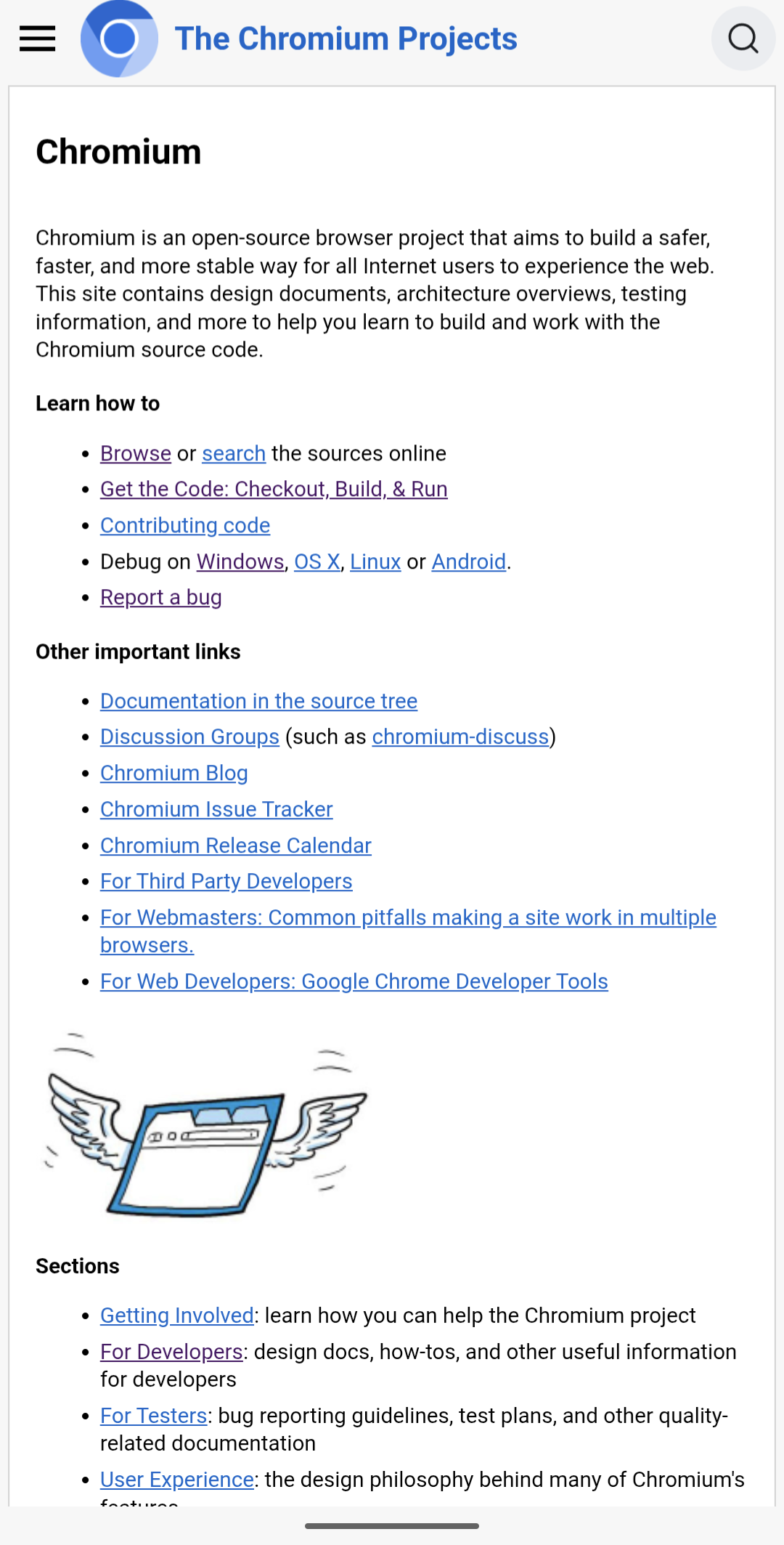
Chromium.org contained valuable technical material, but its shared site architecture remained fundamentally desktop-first. Pages could appear inside a phone-sized screen without forming a coherent mobile experience. The desktop navigation did not translate into an intentional small-screen interaction model, shared two-column layouts were not reliably adaptive, header branding consumed constrained space, and difficult content could force the page beyond the viewport.
This was not only a phone problem. Developers routinely keep documentation beside an editor, terminal, DevTools, communication window, or another reference. Split-screen layouts and narrow browser windows are normal technical workflows. A durable responsive system needed to support the available width rather than treat mobile and constrained windows as exceptional cases.
Designing A Responsive System:
The solution was designed as a shared responsive layer around the existing site, not as a page-by-page redesign. The goal was to preserve Chromium.org's established desktop identity while making its common structures adapt predictably across screen sizes.
Added proper viewport behavior so pages could respond to device width instead of rendering a scaled-down desktop canvas. This established the prerequisite for every later responsive improvement.
Created an off-canvas navigation drawer with intentional entry, dismissal, and containment behavior, then adjusted the header brand for extremely narrow screens so navigation remained legible and stable.
Reworked the site's common two-column structure so navigation and content could reorganize at narrow widths without requiring unrelated fixes on every individual documentation page.
Contained long inline code and slash-delimited paths before they could break the page, while improving desktop continuity by keeping the sidebar available as readers moved through long technical documents.
Systemic Path Wrapping:
Chromium.org also contained long slash-delimited paths that could force layouts beyond the viewport. Fixing individual pages would have left the underlying failure mode intact, so Rito implemented a site-wide rendering transformation that inserts <wbr> break opportunities after eligible slashes.
The implementation had to protect the rest of the publishing pipeline. The transformation runs late enough to preserve headings, attributes, anchors, and table-of-contents generation, while explicitly leaving content inside code, pre, script, style, and textarea elements untouched. That turned another page-specific overflow class into shared infrastructure without corrupting technical content.
Before and after: the homepage
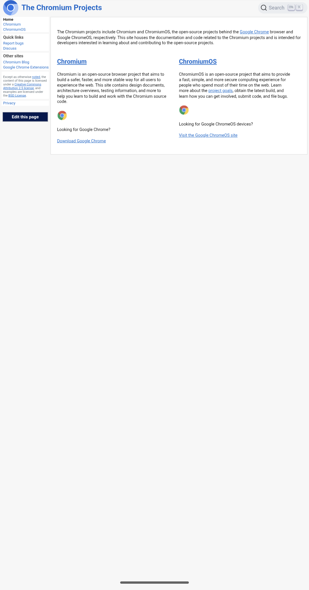
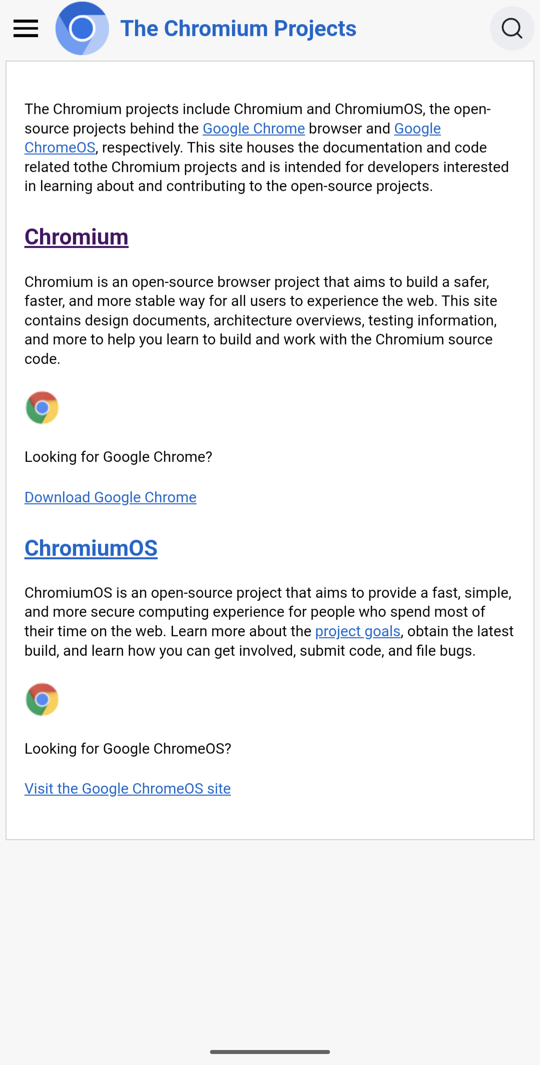
Without viewport behavior, the desktop canvas was simply scaled down to fit the screen. Establishing device width was the prerequisite for everything that followed.
After: the mobile navigation drawer
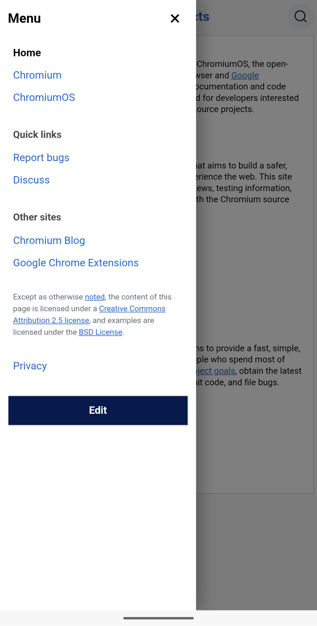
The off-canvas drawer carries the full navigation, including the quick links and licensing footer that had no home on a narrow screen, and dismisses back to the page behind it.
Before and after: the Chromium project page
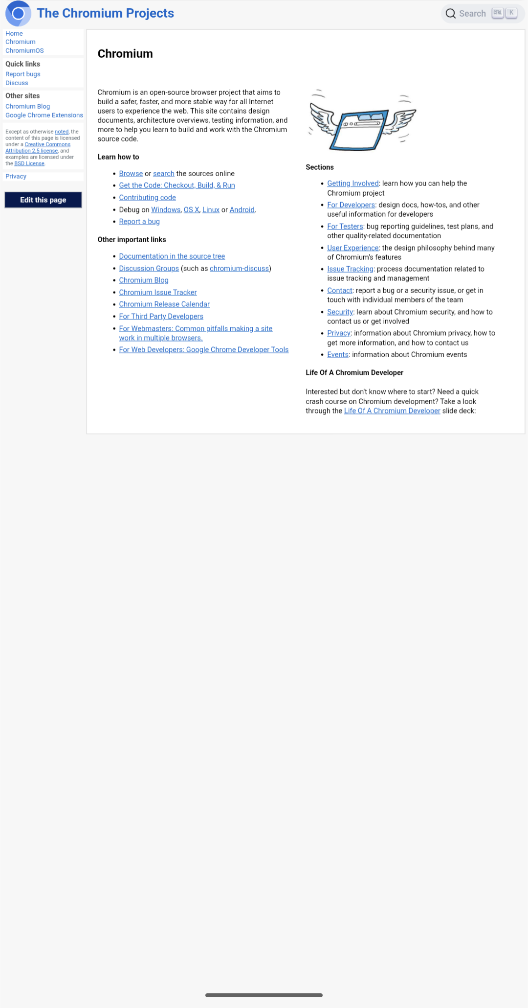
Before and after: the For Developers page
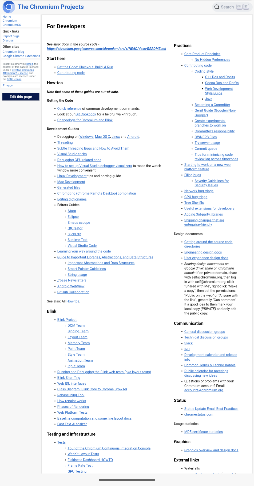
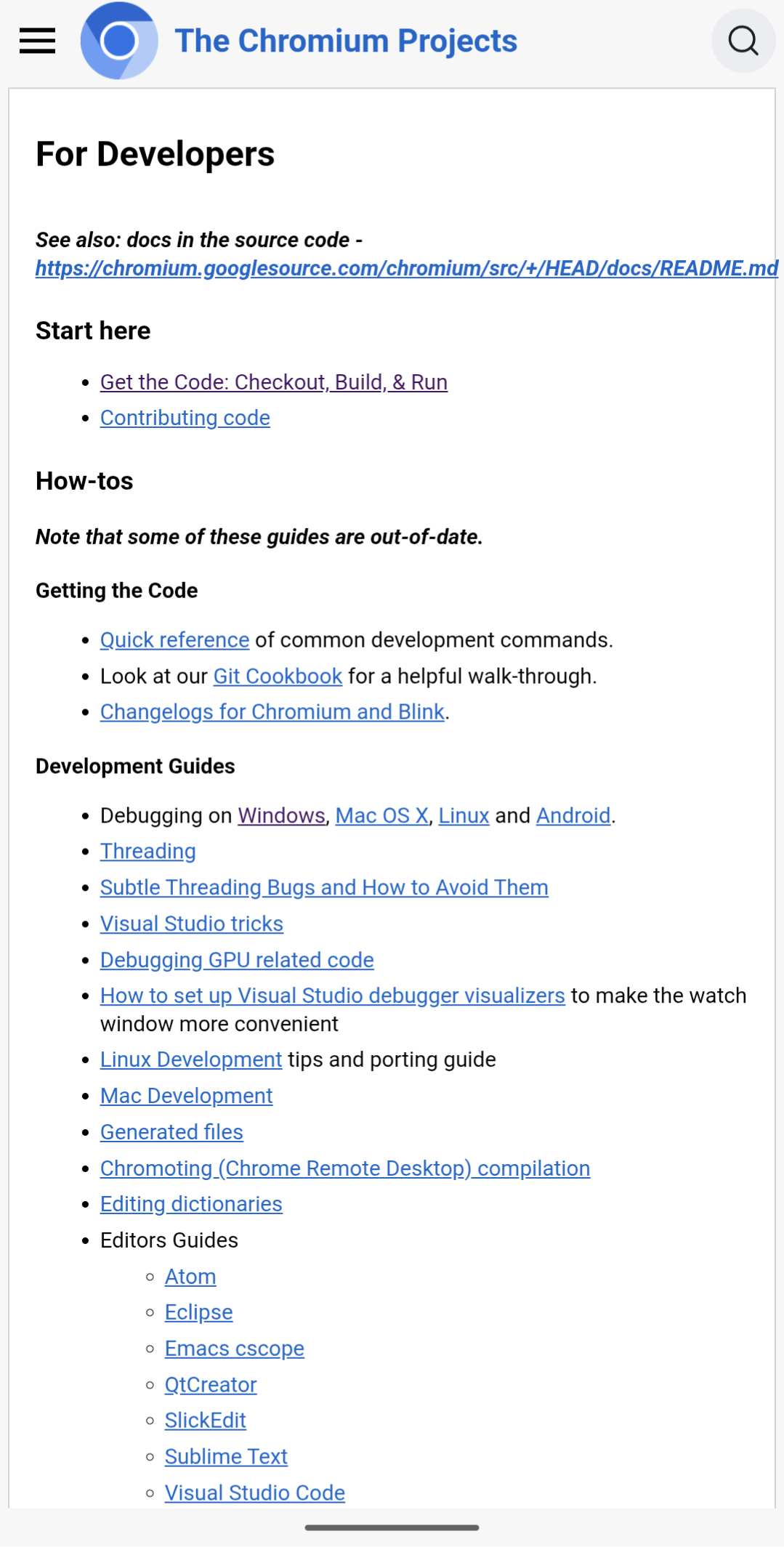
Two different pages, one shared fix. The common two-column structure now wraps into a single vertical column at narrow widths, which is what kept this from becoming a per-page cleanup across the documentation set.
Working Through Chromium Review:
The work was divided into focused change lists and submitted through Chromium's Gerrit workflow. That made each architectural decision independently reviewable and reduced the risk of asking maintainers to accept a broad redesign as one indivisible proposal.
Review covered more than code correctness. Discussion included navigation placement, drawer dimensions, hover behavior, desktop continuity, and how closely Chromium.org should mirror adjacent Google and Chrome website patterns. Rito accepted feedback that improved the product, but also defended decisions when literal parity would have ignored Chromium.org's own information density, navigation labels, and interaction needs.
The resulting architecture reflects that balance: familiar enough to fit the existing ecosystem, but designed around the actual product rather than copied mechanically from another surface. Shared responsive behavior also reduces the likelihood of future CSS changes creating a new round of page-specific overflow and layout failures.
Outcome:
The merged work established Chromium.org's responsive foundation: proper mobile viewport behavior, an intentional mobile navigation system, adaptive shared layouts, resilient handling of long content, and improved navigation continuity on desktop.
Rather than disrupting a long-established developer website, the changes added a durable responsive layer around it. Chromium.org can now better support documentation access across phones, tablets, split-screen developer workflows, narrow browser windows, and conventional desktop browsing.
Merged Chromium Changes: